Showing posts with label Paint. Show all posts

Saturday, February 1, 2014

About a Boy

I'm so excited to share this little update!

My cousin, Tara, is having a baby boy in 5 short weeks. This time has just flown by. I can't get over the fact that it really feels like a month (maybe 2) ago that she was telling me she's pregnant. Almost immediately, I decided that I wanted to help her decorate the nursery by buying her little one a dresser. I had big plans to buy an unfinished one from Ikea, and paint it to coordinate with the colors she chose. After much deliberation, I ended up purchasing the HEMNES dresser in gray-brown. I figured I had more choices this way because the gray-brown color as-is could be a nice natural-looking element that might still coordinate with the light gray crib across the room; but I could also still paint the whole dang thing.

While mulling it over in my head, acting on a tip from my aunt, I visited a local boutique called Gracious Seasons and discovered they carry CeCe Caldwell's chalk paint. I picked up several samples, a tub of wax, and a couple brushes to play around with. I did play around and it is some pretty cool stuff! I'll definitely be working with it...on a future project.

I considered color-matching the crib, but worried that it would be too matchy-matchy or not match enough. After she shared her wall color choices with me, I considered using one of them to paint a simple stripe or two across the top of the dresser. I considered hand-painting an argyle pattern across the middle drawers. In fact, I found inspiration from all over the Interwebs:

this sweet little chevron number,
something striped like this,
and these cool little squares that wouldn't change the look of the dresser too much.

In the end, I just wasn't convinced I wanted to do any of them. I felt very paralyzed when I considered that this boy might use this dresser for the next 5? 10? 15? 20? 25? 30? years. I just didn't feel right about altering its look too much. After consulting the mother-to-be, I felt confident that the dresser was a good color. After thinking about it some more, I decided on a less-permanent option: exchanging the hardware.

Below is what I started with. The hardware that came with the dresser wasn't too shabby. The knobs are made of metal and had a nice weight. If left as-is, they would have worked just fine, but I just had to add a personal touch.


Forgive the super-close and pretty dark photos -- the dresser is currently sitting in the middle of the craft room and there's not a lot of wiggle room, the lighting is bad, and I have no interest in opening the shade for natural light because I'm a vampire.


And here's where it ended up:


Aren't the new knobs sweet? I picked all 12 up at Hobby Lobby where they were on sale for 50% off. I spent about $23. It really lightens the whole thing up and gives it a more baby-ish vibe. I went in searching for 12 of the same, but I'm glad it worked out this way. For one thing, they didn't have 12 of any one kind. For another, I think the varying styles give it a very whimsical vibe. Because the drawers get slightly bigger from top to bottom, I decided on a small, round, and white knob for the top 4 drawers, a slightly larger green one for the middle 4 drawers, and a larger-still black and white chevron dude for the bottom 4 drawers.


I plan on giving her the original hardware so she can neutralize it if she ever wants to, but for now, I think it's pretty cute!


I also picked up this cute little tray on clearance for $5.20. The clearance at at the Lobby of Hobbies is pretty beefy right now. I imagine they're trying to clear out last year's stuff.


Tara thinks she wants to use the dresser as a changing area, so I picture the tray holding things like powder and Butt Paste. I love that Butt Paste is an actual thing.


Also, Carly helped. 


I'm so stinkin' excited to meet that little boy. I sure hope this dresser serves him well for a long, long time.

Tuesday, May 28, 2013

Guest Bedroom: Curtains and Bedding

We're in the middle stages of decorating our guest bedroom. I painted the walls Greystone and the trim Moutain Peak White (both by Benjamin Moore) and upcycled a dated ceiling fan. After that, I stewed for a while about what I wanted to do.

Way back in October, I began making a duvet cover . I bought fabric (a lot of fabric for a lot of money) in yellows and grays to start a quilt and quickly got frustrated with the too-difficult-for-an-almost-novice pattern. Instead, I sewed the hundreds of pieces I had already cut back together to make a strip quilt. When I finally finished it about 2 months later and slipped it on the duvet, I lied to myself for a couple hours before admitting that I hated it. I didn't think much of it. Since I still liked all the individual fabrics, I figured I could just use them on a different project down the road. I also realized that I'd rather stay away from the trendiness of grey and yellow. I ran to Target to see if they were carrying any inexpensive duvet covers that might work. As luck would have it, I ran into this beauty on clearance for about $30!


After purchasing the duvet, everything fell into place. Finally coming to the conclusion that I wanted to use coral tones as the main accent color, I ordered this fabric for the curtain panels I was planning.

While shopping, I noticed some of it was a tad redder than I had originally wanted to go with; but because I had been shopping frustrated for quite a while, I decided take the leap. When it came, It still felt a bit too red. What I didn't originally notice was the orange. Alas, I was stuck with it. That's definitely a risk you take when shopping for fabric online. As the days grew longer, so did my affection for the fabric. I love the gradient effect and I really do love the colors. For some reason, it reminds me of the friendship bracelets I used to make out of embroidery floss. Remember, Mom? Using the same method as last time, I whipped up some curtain panels. Check 'em out.


When making the purchase, I worried the fabric would be too narrow. I planned on cutting the fabric in half to make 4 panels. At 44 inches, it was a skinny mini, but I couldn't bring myself to buy double the yardage. Having to hem almost an inch on both sides, each panel ended up being just over 20 inches. After hanging them, I'm okay with the narrowness. After all, they're just there for looks. We're rocking purpose-serving cellular shades behind 'em.

I hung them using a method I found on Pinterest. Basically, I took a scrap piece of 12 x 12 card stock from my collection. From the bottom right hand corner, I cut a 3 x 3 square. From the top left corner of the small square, I measured 8 inches up (the distance I wanted the curtain rod to hang from the top of the window). From that point, I measured 9 inches to the left (the distance I wanted the curtains to hang from the left side of the window). I pierced a hole through the cardboard, held the 3 inch cut square up to the top left corner of the window, and marked a dot. For the right side of the window, I just flipped the cardstock around and repeated the process. The dots are your drill marks! It's fool-proof!

If you look closely, you can see the marks I made at 8" up and 8 and 9" over.
We bought the curtain rods at (yep, you guessed it) Target. I looked at quite a few places. I really wanted the same ones I bought for the office because they have the same mercury glass detail I replicated on the ceiling fan, but Lowes no longer carries them. I settled for these ones, still featuring the mercury glass detailing I was looking for, just in a different shape. I like them just as well.


So far so good, don't ya think?

P.S. If you enjoy reading my blog, please follow me by clicking "Join this site" and/or entering your email address over to the right of the page. If you want to see what projects I have worked on or plan on working on in the future, follow me on Pinterest by clicking the link to the right! If you like it, pin it!

Friday, April 5, 2013

Serious Upcycle: Ceiling Fan Update & DIY Mercury Glass

Bada bing, bada boom. That cliched expression pretty much sums up how I feel about what I accomplished with $14.04 and 2 hours of my life. Here we go.

The dreaded ceiling fan. So practical. So windy. So aesthetically displeasing. Especially this one, circa 1992 (or so). I didn't really want to remove the fan altogether and replace it with something else. For one thing, it would most likely have been pricey. For another, I might not have liked it too much in the end. So, for the last few days, I've been pondering ways to transform this monster into something prettier. Should I paint it? I thought about painting stripes or cheverons on the blades. Nope. Too crazy/trendy. I thought about spraying the hardware silver and the blades white. Maybe. Then it hit me: mercury glass!

I've pinned a ton of DIY mercury glass tutorials (my favorite being this one), and I've been meaning to try my hand at the magic. This was the perfect opportunity. Having read on several tutorials that the only place to find Krylon Looking Glass spray paint is Hobby Lobby, I headed straight there. On the way, I continued to ponder about how I would deal with the gold hardware and the blades. While in the spray paint aisle, I decided I'd use Krylon's Brushed Nickel for the hardware and leave the blades as-is for now. I wanted to think about it a bit longer before doing any irreversible damage. I'm known for making rash, impatient decisions. Just ask my mom my husband my sister my cousins my co-workers anyone I've ever met.

There she blows before I began spraying but after I prepped the ceiling. Yikes. I think Rich might have murdered me if he knew I was spray painting inside the house in a room that I just spent three days painting. Spoiler alert: I'm not dead. What Rich doesn't know (until he comes home or reads this) won't kill me. No worries. Carrie @ Dittle Dattle showed me it was okay to use the following method. Yes, if Carrie @ Dittle Dattle told me to jump off a bridge, I would.


Before painting the hardware, I had to remove the blades. Here's where it gets good. After taking the first blade off, I discovered that they were reversible! Super! Who chose to use the lighter side? The dark side is so much better. Check it out!


Once the blades were all down, I donned this mask. Safety first, people. I am Luke's father. That's the second Star Wars reference in 5 sentences, and I've never seen even one of those movies.


After a couple coats of brushed nickel, the motor and hardware came out looking more like this:


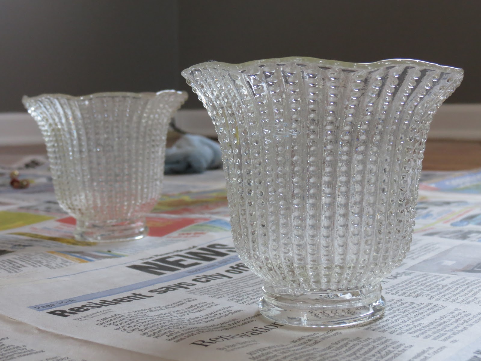
Below are the original glass shades. What is the technical term for those things?  As you can see, they are bumpy. Anyone who knows me knows I detest bumps. Let's not talk about it.


To achieve the desired effect, I sprayed the inside of the shades with a couple thin coats of the looking glass spray. Some of the tutorials I read suggested several coats (up to 5 or 6), but I went with 2 because since it's a light fixture, I wanted to maintain the opacity.


After applying 2 thin coats, I sprayed the painted surface with a 50/50 mixture of white vinegar and water. I let that sit for about a minute then  dabbed with a paper towel moistened with the same vinegar/water mixture.


While wiping, my fingerprints created this masterpiece. He looks happy
about the result, no?
Here's a shot of what it should look like after you've dabbed and wiped. As always, the photo doesn't do it justice. You'll have to try it out and see for yourself!


I could hardly wait to see the final results after replacing the blades on the reverse side. I ripped the newspaper off the ceiling, jumped off the ladder, and scoped out my upcycled ceiling fan. Behold:


It's so much easier this way:

Before


After
So what do you think? Are you as thrilled about this upgrade as I am? At the very least, I dusted the fan blades. At the very best, I got a new fan for $14.04.

P.S. If you enjoy reading my blog, please follow me by clicking "Join this site" and/or entering your email address over to the right of the page. If you want to see what projects I have worked on or plan on working on in the future, follow me on Pinterest by clicking the link to the right! If you like it, pin it!

I'm linked up with:
The Shabby Nest
Jennifer Rizzo
Simple Home Life
Craftionary
The Trendy Treehouse
Tidy Mom
My Romantic Home
Chic on a Shoestring
Beyond the Picket Fence
Fireflies and Jellybeans

craftionary


Greystone for LIFE!

After a long haitus, I'm back and better than ever just as busy. It's just that I'm on Spring recess from work and I've had some uninterrupted time to spend with my house. Let me just confirm: It's been glorious.

It's becomming a tradition to begin a decorating project whilst on Spring break. I'm in the middle of two masters programs and nearing the end of a hectic school year, so needless to say, I've had very little time for any decorating --  let alone blogging. Beginning a new project was just the break I needed. At any rate, I prepped for my week-long break from school by getting my behind to Campbell's Paint and Wallpaper in Dearborn to pick out my paint.

This is what I started with: 3 walls of light to medium blue with 1 wall of medium to dark blue thrown in for good measure, stained trim to match the harwood floors, and a sweet ceiling fan.


Oh yeah, and almost-floor-to-ceiling mirrored closet doors. I can't get away from mirrors in this house. They're the reasons we bought this house. 4 reasons to be exact. What can I say? We're vain people.


I'm still on the grey train. I think it's partly because I've attempted two shades of the color (here and here) and both times, it came out looking very blue. I realize that's a risk you take when painting with as crazy a color as grey, but sheesh. I was bound and determined to perfect the paint-picking process. So I did. Yep, that's right. This color is perfect. Lots of self-love goin' on in this post.

The color I chose is called Greystone by none other than Mr. Benjamin Moore himself. I like. 


The picture above is a bit dark, but you can see how it downplays the orangeyness of the floors.

Oh, and I painted the trim Mountain Peak White (also by BM and the same color as the trim in the two other rooms I've tackled). Doesn't the white trim make the color even yummier? I think so. Except I wouldn't want to eat paint as it probably wouldn't be good for my health.

I will, of course, be adding window treatments, but check out how much better the windows look with the white trim. Mmm hmm.


I love that the color has the quality of taupe. It reminds me of the clay I used back in high school to make the vase that my mom "accidentally broke" the day after I brought it home. Okay, that never happened, but you get the point. I love me some Greystone. 


Thus begins another adventure in decorating. Stay tuned for the reveal of my big plans for that sweet fan. And of course, stay tuned for the styling ordeal. I'm anticipating at least a few weeks worth of work. At least.

In keeping with tradition, color me happy. :)

P.S. Check out Campbell's Paint and Wallpaper in Dearborn, MI for all your paint, wallpaper and framing needs. They offer the best color advice and customer service in Metro-Detroit. They have a full line of stains and tools including Benjamin Moore and Pratt & Lambertt paints. They guarantee their paint and stain color matching, offer in-home color consultations, and service custom picture framing using expert design & workmanship (their every day prices beat Michael's 50% off price). They also offer a large wallcovering library.

P.P.S. If you enjoy reading my blog, please follow me by clicking "Join this site" and/or entering your email address over to the right of the page. If you want to see what projects I have worked on or plan on working on in the future, follow me on Pinterest by clicking the link to the right!