Friday, June 29, 2012

Should I try out for Project Runway?

Yesterday morning, I checked sometehing else off the to-do list for the office/craft room! One step closer, baby! Using your context clues, try and guess what I did.

Sew I decided to buy this fabric from the appropriately named fabric.com. Sew after I bought the fabric, I anxiously awaited the arrival of said fabic. I got 5.5 yards for just over $60 (with a 15% off code from retailmenot.com and free shipping because I was spending more than $40). 60 bucks isn't too bad for home decor fabric. Most of the home decor fabric is at least $24.99 per yard at JoAnn Fabrics. This was $12.49 per yard. Sew once the fabric arrived, and after I did the happy dance, I tore open the package (really I carefully sliced it open with a knife) and out came this:


Sew I did the happy dance again. Are you seeing a pattern here? I sewed curtains!

Anywho, here's what I did:

First, I folded the fabric in half like a hamburger. I hope you get that reference, because if you don't, you're no longer my friend. Just kidding! If you don't know what folding like a hamburger is, just let me know and I'll explain using visual aids next time I see you. Essentially, I folded the fabric in half lengthwise. I bought enough fabric to reach from the curtain rod to the floor twice.

Next, I cut the fabric at the fold. Then, I ironed the fabrc...wah wah waaaaaahhhhhhhh...I hate ironing, but my sewing sensei -- I call her Mom -- insists that ironing is a part of sewing. Iron I did. In fact, I had a conversation with my cousin on the phone whilst ironing. It must have taken me at least 30 minutes. Moving on...

Next, I ironed some more. What? This part wasn't so bad. I ironed the hem for each side of the fabric. I just used the edge of the fabric (where they advertise -- I don't know what it's called) as a guide. 1 inch or so is fine for this step. I turned the fabric up once like this:


Then once more like this. According to Sensei Mom, it helps give the hems a more finished look. She's right. She's always right.


Before sewing, I pinned along the edges (about every 6-10 inches).


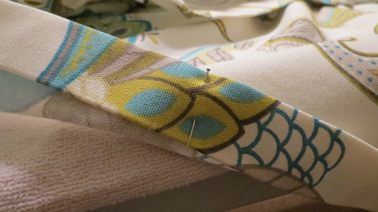
Then, I sewed along the edge of the inside of the fold like sew:


I repeated these steps for the top and bottom, except I created much wider hems. Although for these hems, you really only have to make the first fold about a half an inch. The second fold should be the length you want the hem to be. For the top, I went with nearly 3 inches. For the first panel, I just folded without measuring, but for the second panel, I had to match them up. Before creating the hem, though, I had to check what the circumference of my curtain rod was. The top hem should be big enough for your curtain rod plus at least 1/4 of an inch for clearance and moveability. Mine was only 3/4 of an inch, so my hem was plenty big enough. For the bottom, I went with a 3.5 inch hem. I like a nice wide hem at the bottom of curtain panels. Plus, I had plenty of room to spare since I bought enough fabric to account for these hems. Here's what they looked like finished:


Sew, they looked pretty much just like they looked before I started sewing.

I was finally finished sewing, but I still had to install the curtain rod!

Because Rich wasn't home, and because I'm impatient, I took out the power tools. Actually, only one power tool was involved. The one with the drill bits and the screw driver bit (I'm not sure what it's officially called). It took me a bit to figure it out, but I got the hang of it eventually. I just followed the directions in the curtain rod package and hung that baby up. I'm so self-sufficient. I can't stand it! Here they are, in all their glory:


What do you think?! I'm thinking of hanging them using drapery rings like this, but I'm not sure. Do you have an opinion one way or the other? I feel like it might give me more control over where the pleats land. One step closer to a finished office/craft room! Here's what's left on the to-do list:

1. Stain that round table in between those sweet chairs.

2. Stain the craigslisted 1940s library file cabinet.

3. Begin officing and crafting.

I don't think I'm ready for Project Runway yet, but maybe one day.

Tuesday, June 19, 2012

Free? Sign Me Up!

I've been busy since school got out. I revised some wall art that didn't live up to my standards and I painted, filled and hung some frames that have been sitting around the house for a year and a half.

Two Christmases ago, I received some custom frames from my aunt, Mary. This is what they looked like before I pushed up my sleeves:


Okay, so I had already pushed up my sleeves a little. I tend to get a little impatient and forget to take pictures along the way. That blue one in there wasn't always blue. It didn't stay blue for very long. I ended up painting all of them white:


I simply sanded each frame just a bit then used some leftover white trim paint to coat them. If I would have used spray paint, the process would have been much quicker, but I didn't have any on hand. I ended up having to coat them all about four times to get a good even look.

After painting them, I arranged them in a way I liked (which can also be seen above). Then, I traced each frame on construction paper. I cut out each square and taped them to the wall in the same orientation that I chose earlier. I put a nail right into the wall through the construction paper. This was sort of an arbitrary process. I just estimated about half an inch from the top in about the middle of the paper. I figured I didn't need to measure since the frames were sort of randomly assembled anyway. When I was finished, I tore off the paper to leave the nails exposed and ready for service.


Finally, I cut scrapbook paper to fit each frame. Here's what happened:


I'm ultra happy with the results of this project. It was especially satisfying because it provided me with (almost) instant gratification. The painting took a while since I had to use real paint, but the tracing and the filling took little more than a half hour. Plus, it was free! I had had the frames for over a year, I have a zillion pieces of scrapbook paper on hand, and I already had the construction paper, nails and tape. Free is always good -- especially when you feel like you've been spending a lot on a certain office/craft room project.

Just a couple more steps before the room is complete! What do you think so far?

Hello, My Name is Katie and I'm a Perfectionist

Remember those canvases I painted a couple weeks back? I was pinspired and I think I rushed into it.


I liked them (a tiny bit), but I didn't like them for the room. I probably could have lived with them (unhappily) for at least a while. Then, one Saturday morning I checked out The Estate Sales Network. I came across these gems here:


Online, they looked promising. I enlisted the help of my cousin, Kim, her boyfriend, Eric, and Eric's bigredtruck. When we got to the house, we had to take off our shoes. Thoroughly weirded out, we entered the expansive ranch. Based on the photos online, I knew they were in the basement. After a little searching, I headed down. I was welcomed by these babies. Just like most everything else in the house, they came right out of the 1970s. While they're well over 30 years old at this point, they are in wonderful shape. They show little signs of wear and tear, and the cushions are still very firm. The color made me smile. After much debating, and a little bit of haggling, I bought them for $50 a piece.

Once we got them home, they went straight into the garage. I was afraid to leave them outside for too long, but I didn't want any mustiness finding its way indoors. Finally, I borrowed a carpet/upholstery cleaner, cleaned them, and brought the new additions inside. Once inside, my artwork definitely didn't jive.


I don't have a picture that features the art and the chairs, but you can probably see that they just don't look right together. However, the chairs do look pretty snazzy, don't they? I think so too.

Anyway, after days of thinking and stewing over those darn paintings, I finally settled on an idea. I considered covering the canvases with fabric similar to this:

Design Dazzle

I also considered painting the canvases white and using metal repair tape to create something special like this:

Metal living room
Better Homes and Gardens

I really like the way that one looks, but I wasn't sure I could pull it off well enough to be happy.

Very briefly, I considered purchasing something in a store. I found some pretty cool mirrored accents at Pier 1, but at $40 a piece, it wasn't really an option. Plus, I really enjoy the DIY process. I love the feeling of gratification I get when a project comes to a close and I really love it. Buying something was off the table.

Finally, I took a trip to Michael's and bought some Martha Stewart stencils, a couple of tubes of craft paint that would coordinate a lot better with the room, and some decent brushes meant for stenciling. I have always avoided stenciling in the past because the paint always seems to bleed. Because this was my last ditch effort at a DIY miracle, I decided to give it a try. I think the decent brushes made all the difference. Sponges are cheap, but they collect so much paint that it makes it hard to maintain a clean project.

After several hours of work (about 4 total), I ended up with this:


Holy cow, am I a happier camper! You might be able to pick out a couple of bleeding mistakes here and there, but overall, I'm satisfied. I used Martha Stewart's Aquarium in pearl finish, Green Olive in satin finish, and Gray Wolf in satin finish. The blue one looks so much better from the side. Because of the glare from the window, the luster catches the light and it's hard to see. Part of me wishes the green one had the same pearl finish as the blue or that the blue one had the same satin finish as the green, just for the sake of consistency; but variety is the spice of life, after all. I'm considering taking a trip back to Michael's to see if they have a clear-ish color in the pearl finish so I can go over the green canvas completely. I'm afraid I'll ruin it. We'll see. For now, it'll do.

Our office/craft room is coming along. Here's what's left on the to do list:

1. Sew curtains. There's always the option to buy, but I'm into the DIY lifestyle these days. Plus, putting a hem or two in a panel of fabric should be easy as pie.

2. Hang curtain rod and curtains.

3. Stain the table in the middle of the chairs darker.

4. Stain the 1940s library file cabinet I Craigslisted (yay!) darker.

5. Fill the shelving units with more TJ Maxx froo froo, as my mom likes to call it.

I can't wait until it's all finished so I can take pictures of the whole shebang. I hope y'all are excited too!

Sunday, June 10, 2012

Just Call Me Jean Dujardin

This weekend, I felt summer vacation nipping at my heels. Even though I still have a whole week left, and even though I'm teaching summer school (starting the Monday after school gets out), I can already feel the cramp in my grading hand starting to loosen. In the spirit of the season I took on a project. Because I figured I'd miss the hand cramp, I chose a painting project that would help to ease it loose gradually.

My inspiration came from Sherry @ YoungHouseLove. She took her cue from a print she found online. You can see my pin here. Anywhoo, this DIY artwork is the newest addition to our office/craft room redesign (BTW, there have been some furniture changes/adjustments since last we met...updates to follow).

Here's my Pinspiration:

Pinned Image


I've been inspired for several months, but because of life, I wasn't motivated until yesterday morning. I wasn't certain of the colors I would go with, but I knew I could get some small paint samples at Lowes for a couple bucks a piece. I drove to Lowes with a loose color scheme in mind. When I got there, there wasn't a huge selection. The paint expert told me that they could mix a sample of any color they offered, but I was happy enough with the ones that were already bottled. I chose Lincoln Cottage Black, Indigo Streamer (I didn't end up using this one), Desert Hotsprings, and Gypsy Teal, all by Valspar. I still had some Benjamin Moore Mountain Peak White left over from the office trim which I used to create new colors by mixing. The paint cost $12 total. I got the canvases (two 24" x 18" and one 24" x 12") and the sponge brushes at Michael's for $27 total. All the items were on sale and I had a coupon for 20% off my entire purchase, including sale items! I already had some sponge brushes on hand at home, but I decided to buy a large package of better quality ones (mine were from the dollar store) because of the nature of the project. Plus, knowing that the project might take a while, I wanted to be able to throw them away liberally as they dried out.


I started out by penciling lines to guide my way. I chose 1.5 inches for the spacing. I guess I didn't take a picture of that. Then, I filled in each narrow section with randomly alternating colors. My inspiration said she used the corner of a plastic card for the peaks of each shape, but I just free-handed it. I was using 1-inch sponge brushes, so the angle made it easy.

The process was looooooong (about 6 hours on Saturday plus 3 hours on Sunday counting snack, tv and stretch breaks), but fun and relaxing. Even though it was long, it was as easy as 1:


2:


3: 


Here's where I school you guys. I've seen things all over the Internet about how to hang stuff on the wall. One of the best tips I've seen is to trace whatever it is on paper and tape the paper on the wall. That way, you can readjust before you actually mount. You can hammer the nail right into the wall, right through the paper, then rip the paper free. The nail remains and you should have a pain-free hanging experience. I did sometehing similar. I used wrapping paper. I happened to have good quality paper on hand that has grid marks in 1-inch intervals. This made it really easy because I didn't even really have to trace. I just counted squares and cut.


As you can see, I did make a mistake cutting. The piece of paper on the far right is a bit longer than the rest. So much for pain-free hanging, huh? It didn't really matter, though. The top of each piece and the spacing between were the most important factors. 


Below is what it looks like on the wall. I have to say, it looks way better in person. I used some of the wall paint on the pieces, so it  blends in a bit. Plus, I took all these pictures with my phone, bad lighting and all. Anywhoo, there it is in all its glory.


I ended up spending about $39 total on the project. I'll keep the paint on hand for future projects (I've already started painting some picture frames for another wall) and I still have a few sponge brushes left over. I figure I would have spent the same or more on something from a store. I'm not 100% thrilled with the color scheme, but it's growing on me. I'm going to let it sit for a while and see how I feel a bit later.

Do you like them? Any suggestions? Should I space them out a bit more or keep them exactly where they are? Once I take pictures of the entire, finished, room, it will be a little easier to tell what they actually look like in there. Tell me what you think. Be brutally honest. The artist in me can take it.

Monday, May 14, 2012

New House! Just Kidding...

Did I trick you? I didn't think so...

While waiting for update posts on our office/craft room (I know you're waiting with bated breath -- you don't have to tell me), I'll fill the void with the story of a different redocoration: the great outdoors. There were many things we could have done when shopping for a new home. It was a buyer's market, so we could have purchased a large, new construction at a fraction of it's "worth." We could have jumped into a fixer-uper with lots of potential. We ended up in this house:


Forgive the strange photo. I took this one morning as I was pulling away for work. That's part of the car door you see in the upper left corner. Also, don't judge us for the weird landscaping. I'm not sure how that half circle tree thing happened. Was it an evolution of pruning? Was it planted that way on purpose? Who knows. Either way, it needs to change. One step at a time, people! What you can't see is the right side of the house. After buying the house, with the help of Rich's dad, we pulled a large (taller than the house) piney tree from the ground, (most of the) roots and all. We were also parents to a big ugly bush. We gave it up for adoption.

Anyway, we bought the house for many reasons. First, it was convenient. We first rented from friends of my sister's. It was a win-win for both parties. They got to move into the house of their dreams, we escaped apartment living. We spent two seperate chunks of time house hunting in the two years prior and settled on an apartment for several reasons. We fell into the opportunity to rent this home, and it just worked. We also love the neighborhood. It's an old (1970s) sub division. Many of the occupants are original owners. Those who aren't are upstanding citizens. With a few exceptions, families take pride in the places they call home. Finally, we were lucky. The previous owners did some great upgrades including a close to full kitchen renovation and a...wait for it...brand new garage. Sign us up.

While there was so much we loved about the house, there was one looming factor that I couldn't get over: all that ugly brown trim. I'll try to keep this from becoming the cliche of the century, but: Fast forward until...Easter-ish. I've been wanting to paint all the ugly brown trim for a century at least. I've already told you about my impatience, so you can imagine how I felt for the past 1.85 years. In a word: grossedout. Let's get to the good stuff. Here's what it looks like now:


I think my camera must have been on a weird setting because the roof looks red. That doesn't matter, though. Check out the trim and shutters! We went with the tone-on-tone look for the aluminum trim and a go-to shade of mine for the shutters: mossy khaki green. I don't have the exact names of the colors on hand right now. Let's just feel secure in saying that it looks 152% better than it did before. We still have the cement colored brick and dark brown roof to contend with, but when I focus just on the center third (ish) of the house, I smile.

Okay, now that it's May 14, and our house looks generally better, I'd like to share some landscaping pictures. No stories attached. I wish I had some befores. I don't. Get over it. Enjoy. I know I am.


Sunday, May 13, 2012

Color Me...

Like many other new home owners, when we first purchased our house, we made a list a mile long of projects we wanted to complete. It has taken a while, but I have finally come around to the idea that we can't do everything at once. Actually, it's less that I've come around to it and more that I was forced into the idea. For one thing, we don't have unlimited funds. I know, it's surprising giving the vastness of our square footage. We're less-is-more people. More than that, there are only 24 hours in a day. On an average day, Rich and I both spend at least 9 hours a day working and commuting. Currently, I'm working on two Master's degrees, and we have various other day-to-day...stuff to do. Nevertheless, there are many projects, large and small, on our short-term list.

Over the last couple years, we've tried to prioritize in attempts to stay sane. Sometimes it works, sometimes it doesn't. I think if asked what my biggest flaw is, Rich would say it was my impatience. I'm not so impatient with kids or other, larger, humans, but I'm very impatient with projects. Like Veruca Salt impatient. Crate and Barrell's Sloane desk is to me as Oompa Loompas are to Veruca Salt.


Several months ago, we decided one of our first priorities would be our office/craft room. We sat and sat, pondering over different paint colors and styles. Finally, knowing that I would be off for a week with nothing productive to do (Spring Break), I visited Mary & Mike Ray at Campbell's Paint and Wallpaper for some paint! Having only a vague plan in mind, I made my decision based on my tastes and Mary's recommendation. Here's what happened over Spring Break:


First, some before pictures. When we moved in, this was the paint sitch. Where the colors meet, there was a baby themed wallpaper border. That was one of the first things we removed when moving in, but the room sat in a condition similar to this for...ever. The table you see under the window wasn't there. I use that table and the one you see peeking from the right edge of the shot for crafting. Color me Badd. That was both a reference to the way the room looks and to the 90s R&B group.


Below is the closet in its original-to-us condition. Notice the really stylish bookshelf to the right of the closet. It was part of the decor in my room at my parents' house. The closet was really just a catch all for games, DVDs/Blu Rays, scrapbook albums, and other various odds and ends. The lack of a door or curtain has potential in the room, though. It really opens it up. If I can manage to keep it organized, I'd like to keep it this way. Color me ready for change.


On to the redecorating. On day one of Spring Break, I removed all furniture and fixtures from the room and cleaned the walls and ceiling. I didn't take a before picture of the celing, but there was a ceiling fan where that hole is. What's that you ask? Did I remove the ceiling fan myself? Why, yes, I did! I just patted myself on the back. You can pat me on the back next time you see me.


On the same day, I removed the one built-in shelf from the closet. Another first for me: spackling. After removing the shelf, I spackled and sanded where needed. Color me proud.


Finally, on day two of SB, I was ready to paint. One more first for me: cutting in along the ceiling. While it wasn't on my bucket list, I added it later so that I had something to check off.

I think this picture features closet painted and room primed plus one coat. I was disappointed because the color reads much bluer than I hoped it would. It's called Mount Saint Anne by Benjamin Moore. While I hoped for a color that read more grey than blue, I was happy with the final result. Stay tuned!


The color looks a little greyer here. I'm sure it has something to do with the trim being painted Mountain Peak White (also by Benjamin Moore).  Doesn't the white trim look wonderful? I can't stand it. It's a whole different room. I. Love. It. Update: Rich worked very hard installing all new electrical sockets in the room. The original-to-us ones were off-white. We couldn't have that. All white worked better. Paired with white socket covers, it looks lovely. Pat Rich on the back next time you see him too.


Just for the heck of it, here's a picture of what the actual paint looks like. See how grey it looks in the can? Well, it's not in the can here, but you get the point. Oh, well.


The closet and the ceiling is Limesickle by Benjamin Moore. Obviously, it's not what one would imagine when thinking of a limesickle, but it definitely has some green in it. I thought of what a lemon ice looks like (close to white). I think this is the same idea. A lime ice would probably be close-to-white-green, much like Limesickle paint by BM.


Here's the light fixture we chose. If I'm honest, I'm not really happy with it. The same fixture came in a hanging version which I did enjoy. I thought going with this one would give me the same look without the drama the hanging version provides. It doesn't. What makes it worse, we spent 106 bucks on it. While shopping for desks a couple weeks after buying it, I spotted this one at Ikea. $29.99. Are you serious? Color me disappointed. Update: Rich worked his butt off installing the new light fixture. It wasn't super easy either. Way to go, Rich!


Fast forward to right this second. We've been searching for a desk for several weeks now. Rich often complains that I would buy the first thing we find. He's usually right -- I would. Except, I wouldn't buy the first thing I came across if it were not functional or ugly. I guess I'm just easy to please (I think Rich would beg to differ on that one, too). Originally, I was thinking I wanted more of an executive style desk. I said of our redecorating experience, "We have champagne taste on a decent wine budget." I love the idea of things like wainscoting and nice, solid furniture. It's just not always appropriate for our modest home. An executive desk and two flanking bookshelves just aren't appropriate for that 10 x 12 room. Plus, in our searching, we discovered that we really don't need a ton of desk space. I use the room more for crafting than anything else. We use the computer in there, but I don't do homework in there. We pay the bills at the kitchen counter. What we need more than anything is shelf space. I have a ton of books, and I love to fill nooks and crannies with fun accessories from TJ Maxx. We finally settled on the Sloane desk from Crate & Barrell. Here's a picture of it in the room:


It's actually 4 different pieces. There are three bookshelves and one bookshelf/desk section. I can't wait to see what it looks like with stuff on the shelves. For the time being, I can live with that chair from Ikea. I have dreams of something super sleek in a cool color. In time. In the picture, you can also see the area rug I settled on after several weeks of searching. I wasn't 100% sure what I wanted in a rug either, but I'm happy with this one. It came from an unlikely source: Value City Furniture. It was a floor sample, so I got it for 50% off the list price. Color me satisfied.

There's still much to be done in this room. For the sake of keeping you as a reader, I'll save the rest for later.


Color me happy. :)

P.S. Check out Campbell's Paint and Wallpaper in Dearborn, MI for all your paint, wallpaper and framing needs. They offer the best color advice and customer service in Metro-Detroit. They have a full line of stains and tools including Benjamin Moore and Pratt & Lambertt paints. They guarantee their paint and stain color matching, offer in-home color consultations, and service custom picture framing using expert design & workmanship (their every day prices beat Michael's 50% off price). They also offer a large wallcovering library.