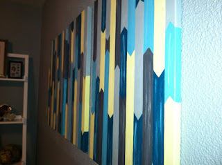
My inspiration came from Sherry @ YoungHouseLove. She took her cue from a print she found online. You can see my pin here. Anywhoo, this DIY artwork is the newest addition to our office/craft room redesign (BTW, there have been some furniture changes/adjustments since last we met...updates to follow).
Here's my Pinspiration:
I've been inspired for several months, but because of life, I wasn't motivated until yesterday morning. I wasn't certain of the colors I would go with, but I knew I could get some small paint samples at Lowes for a couple bucks a piece. I drove to Lowes with a loose color scheme in mind. When I got there, there wasn't a huge selection. The paint expert told me that they could mix a sample of any color they offered, but I was happy enough with the ones that were already bottled. I chose Lincoln Cottage Black, Indigo Streamer (I didn't end up using this one), Desert Hotsprings, and Gypsy Teal, all by Valspar. I still had some Benjamin Moore Mountain Peak White left over from the office trim which I used to create new colors by mixing. The paint cost $12 total. I got the canvases (two 24" x 18" and one 24" x 12") and the sponge brushes at Michael's for $27 total. All the items were on sale and I had a coupon for 20% off my entire purchase, including sale items! I already had some sponge brushes on hand at home, but I decided to buy a large package of better quality ones (mine were from the dollar store) because of the nature of the project. Plus, knowing that the project might take a while, I wanted to be able to throw them away liberally as they dried out.
I started out by penciling lines to guide my way. I chose 1.5 inches for the spacing. I guess I didn't take a picture of that. Then, I filled in each narrow section with randomly alternating colors. My inspiration said she used the corner of a plastic card for the peaks of each shape, but I just free-handed it. I was using 1-inch sponge brushes, so the angle made it easy.
The process was looooooong (about 6 hours on Saturday plus 3 hours on Sunday counting snack, tv and stretch breaks), but fun and relaxing. Even though it was long, it was as easy as 1:
2:
3:
Here's where I school you guys. I've seen things all over the Internet about how to hang stuff on the wall. One of the best tips I've seen is to trace whatever it is on paper and tape the paper on the wall. That way, you can readjust before you actually mount. You can hammer the nail right into the wall, right through the paper, then rip the paper free. The nail remains and you should have a pain-free hanging experience. I did sometehing similar. I used wrapping paper. I happened to have good quality paper on hand that has grid marks in 1-inch intervals. This made it really easy because I didn't even really have to trace. I just counted squares and cut.
As you can see, I did make a mistake cutting. The piece of paper on the far right is a bit longer than the rest. So much for pain-free hanging, huh? It didn't really matter, though. The top of each piece and the spacing between were the most important factors.
Below is what it looks like on the wall. I have to say, it looks way better in person. I used some of the wall paint on the pieces, so it blends in a bit. Plus, I took all these pictures with my phone, bad lighting and all. Anywhoo, there it is in all its glory.
I ended up spending about $39 total on the project. I'll keep the paint on hand for future projects (I've already started painting some picture frames for another wall) and I still have a few sponge brushes left over. I figure I would have spent the same or more on something from a store. I'm not 100% thrilled with the color scheme, but it's growing on me. I'm going to let it sit for a while and see how I feel a bit later.
Do you like them? Any suggestions? Should I space them out a bit more or keep them exactly where they are? Once I take pictures of the entire, finished, room, it will be a little easier to tell what they actually look like in there. Tell me what you think. Be brutally honest. The artist in me can take it.


They look great!!!! - Rich
ReplyDeleteThey look so much better in person, but I'm still unsure of whether I like them or not...Hmmm...
ReplyDeletei love them katie! very good :)
ReplyDeleteThanks! I wasn't really happy with them, so I ended up painting right over them. I'm sure you saw that post too! Lol...
ReplyDelete